Display P3 covers 25 percent more than sRGB
The colours did not change in transit — the box they were measured against did.
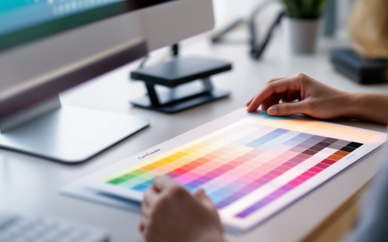
The box that colour lives in
Every colour value in an image file is a number — or more precisely, three numbers, one each for red, green and blue. Those numbers mean nothing on their own. A value of 200 in the red channel could describe a warm amber or a pale blush depending on which set of rules you use to decode it. That set of rules is called a colour space, and the three you will meet most often — sRGB, Display P3 and ProPhoto RGB — describe three different sized boxes. The numbers are measurements; the colour space is the box they were measured inside.
sRGB was defined by HP and Microsoft in 1996 and standardised by the IEC as IEC 61966-2-1 ↗ shortly after. It was sized to match what cathode-ray monitors of that era could actually show, which means it is modest by current standards. Most JPEG files, most web content and most phone screenshots assume sRGB unless told otherwise. Display P3 is wider — it was developed by Apple from the cinema DCI-P3 standard and covers roughly 25 percent more of visible colour than sRGB, concentrated toward saturated greens and reds. Modern iPhones, recent Android flagships and most good IPS and OLED monitors can show it. ProPhoto RGB is wider still: it extends beyond what any current display can render, which makes it useful as an internal working space in Lightroom or Capture One precisely because it does not clip colours during editing.
What goes wrong at the handoff
Here is where the mismatch happens. You edit a file in Lightroom in its default working space, export it as sRGB, open it on your calibrated monitor — looks exactly right. You send it to your phone. It looks right there too, because the phone is interpreting those sRGB numbers against an sRGB reference. Fine.
Now consider a different path. You export as ProPhoto RGB because someone told you that ProPhoto keeps more colour. You send that file to a friend. Their phone, their browser, their messaging app — most of them do not read embedded colour profiles. They see raw numbers and assume sRGB. A number that was supposed to represent a vivid, slightly out-of-sRGB-gamut green gets read as if it were an sRGB number, which means it gets stretched, remapped and displayed at full saturation against the wrong reference box. The image looks garish, or weirdly shifted, or both. Nothing changed in the file — the interpretation changed.
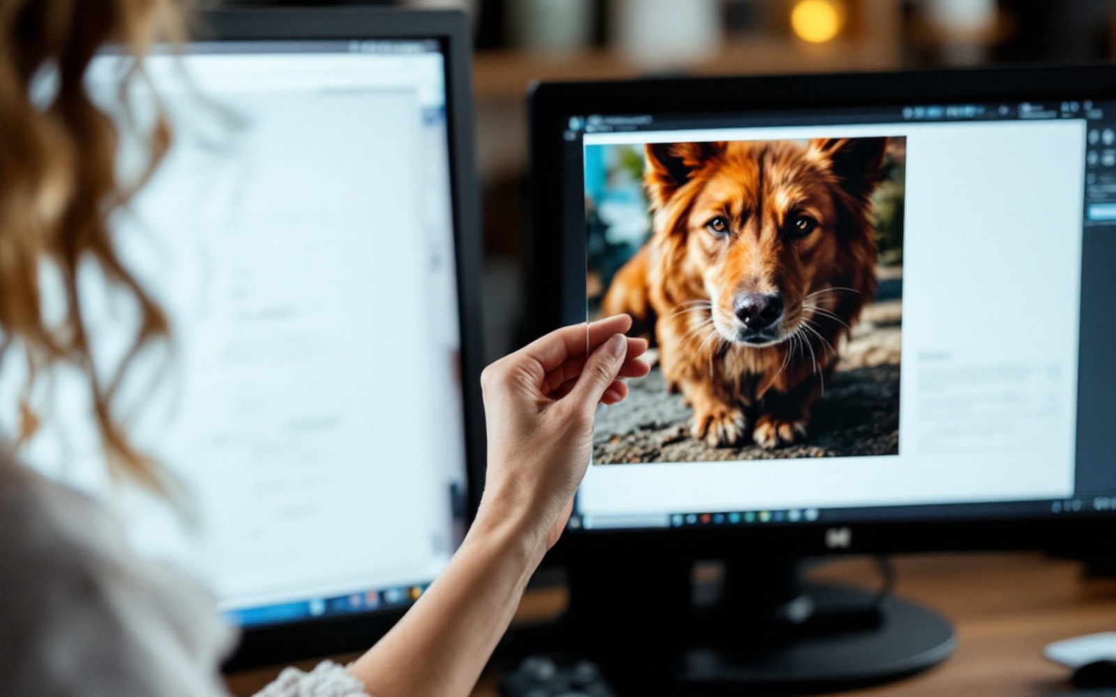
The technical term for that misread is an untagged or mismatched profile. The file carries an ICC profile ↗ — a small block of data that says which colour space the numbers live in — but the receiving application ignores it or cannot read it. A file without any embedded profile is worse still: the decoder makes its own assumption, and that assumption is almost always sRGB.
Profile, gamut and the phone that sees everything differently
Gamut is the range of colours a space can describe. Think of it as the floor plan of the box. sRGB occupies a relatively small triangle on the CIE chromaticity diagram; Display P3 is a larger triangle; ProPhoto is a still larger one that reaches into colours no screen has ever physically shown. When an editor converts between them, it moves the numbers and rescales them to maintain the visual appearance — the colour remains the same, the measurements change. When an app strips or ignores the profile, it keeps the old measurements and loses the meaning.
The problem is most visible with saturated colours: skies, foliage, product reds. A sky rendered carefully in your editing software, with a blue sitting just outside sRGB, will snap to a different — usually more electric or more muted — blue when the profile is dropped. Neutral areas survive the trip better, because sRGB, Display P3 and ProPhoto all agree on white and black; the disagreement is at the vivid extremes.
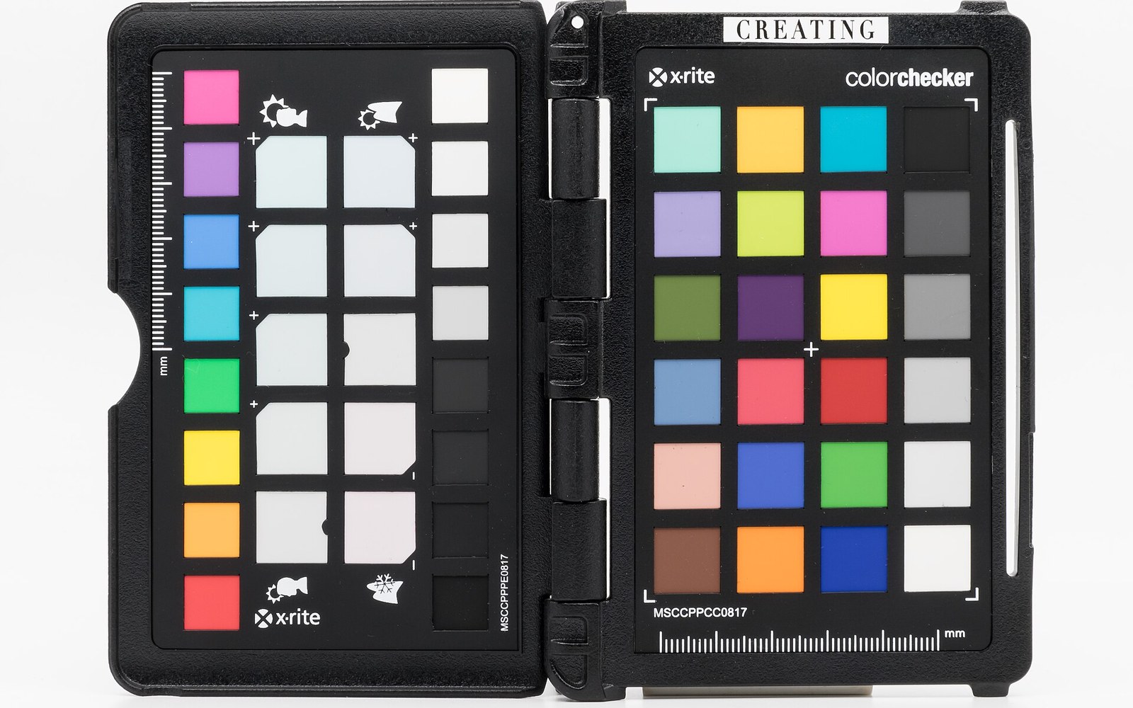
Modern phone cameras shoot in Display P3 by default, which is why a photo taken on a recent iPhone and edited with profile awareness can look lush even on a non-wide-gamut screen — the values are mapped correctly to whatever the output device can show. That same image handled carelessly, with its P3 profile stripped by a messaging app's recompression, can exit the pipeline looking over-saturated or tonally flat depending on which direction the misread goes.
What to actually do
The practical resolution is simple once you understand the mechanism. For anything going to the web, social platforms or messaging — export sRGB. Every device and every application handles sRGB correctly, even if it cannot handle wider spaces. You lose a little colour range relative to what your calibrated monitor shows, but you lose it on purpose and on your terms, not accidentally.

For files that stay inside a serious editing environment — passed between Lightroom and Photoshop, processed in Capture One and handed to a print lab — use the wider working space and export with the profile embedded. A print lab running a colour-managed pipeline will read the ICC profile and convert correctly at the point of output. Soft proofing ↗, where you simulate the gamut of the output device on-screen before you commit to a print, is the tool that makes this visible before any ink moves.
The one practice worth forming as a habit: never strip a profile on export unless you are certain what the receiving application will assume. Most programs give you an option to embed the profile or convert on export — embed sRGB for the open web, embed the correct profile for closed workflows, and convert rather than strip when in doubt. A file arriving in sRGB, correctly tagged, will look right everywhere. A file arriving in ProPhoto, incorrectly tagged as sRGB, will look like someone turned the saturation up and then dropped it in a different room.
The colours were right all along. The box was just being misread.